Color isn’t just about taste—it’s about mood, energy, and flow. Choosing the right shades for your home can transform disconnected rooms into a calming, cohesive space that reflects your personality. But how do you create a palette that feels both stylish and you?
For Lykkers ready to refresh their space without feeling overwhelmed, this guide offers a relaxed, easy-to-follow approach to building a color palette that works in real life—no design degree needed.
Part 1: Build Your Color Foundation
Before you start picking swatches or scrolling through paint charts, it helps to understand the basics of color flow. In this section, we’ll help you lay the groundwork for a palette that feels connected across your entire home—not just room by room.
Start with a base color you love
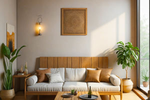
Choose one main color that you’d be happy seeing throughout your space. It doesn’t need to be dramatic—think soft taupe, navy blue, or sage green. This shade becomes your anchor and helps tie everything else together.
Consider your natural light
Walk through your space at different times of day. Rooms with lots of sunlight can handle cooler tones, while darker rooms might feel warmer with creamy neutrals or muted pastels. Light affects how color shows up, so use it to guide your choices.
Think in tones, not just colors
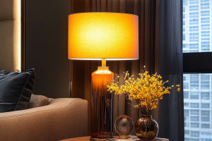
Instead of grabbing a rainbow of your favorite shades, focus on tone families. Cool tones (like blue-grays or dusty greens) pair well together, while warm tones (like terracotta or mustard) create cozy, inviting vibes. Stick to one family for consistency.
Pull color inspiration from something personal
Your favorite scarf, a vacation photo, or even a ceramic vase might hold the perfect combo of shades. Use those real-life items to spark ideas and guide your color picks—they’ll help your home feel more personal and less trend-driven.
Create a simple three-color rule
Use one main color (60%), one secondary color (30%), and one accent color (10%). This makes it easy to balance bold and neutral tones across furniture, textiles, and decor. You’ll get variety without chaos.
Part 2: Apply Your Palette Room to Room
Now that you’ve built a strong foundation, let’s talk about how to carry your color palette through your space. This next part focuses on adding color in layers so your home feels both interesting and unified—without every room looking the same.
Repeat key colors in different ways
You don’t have to paint every wall the same shade. Instead, repeat your base and accent colors through furniture, throw pillows, rugs, or even artwork. That subtle repetition helps connect rooms while letting each space breathe.
Let one room softly lead to the next
Think of color as a gentle transition, not a stop-and-go. Use adjacent shades or shared undertones between rooms to create a smooth visual flow. A living room in muted blue might lead into a dining space with slate or sky tones—it’s connected but not identical.
Add neutrals to balance things out
Neutrals—like cream, charcoal, or soft beige—give your bolder colors room to shine. Use them for larger pieces like sofas, curtains, or walls. They calm the space and make your intentional color choices stand out more clearly.
Play with texture, not just color
If you’re working with a tight palette, layering textures keeps it interesting. Think velvet cushions, woven baskets, matte ceramics, or wood finishes. Even within the same color range, texture adds depth and variety.
Test small before going big
Before you commit to a full room makeover, try your palette in a smaller spot—like an entryway or reading corner. Bring in a rug, paint a sample, or add accessories in your chosen colors. It’s a no-pressure way to experiment before going all in.
Creating a cohesive color palette doesn’t mean choosing only one shade—it means choosing thoughtfully. When you anchor your home with colors that feel like you, and carry them through with intention and creativity, everything feels more grounded and effortless. Lykkers, your space should support your life and your style—so pick colors you enjoy, and let your home tell your story, one room at a time.